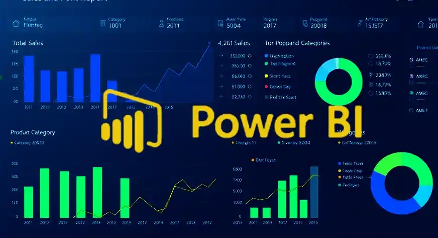
In the modern business landscape, data is one of the most valuable assets for decision-making. Sales teams generate massive amounts of data daily, and turning this data into actionable insights is crucial for growth. Microsoft Power BI is a powerful business intelligence tool that enables organizations to create interactive and visually appealing sales dashboards.
This guide explains how to build interactive sales dashboards using Power BI, including key features, steps, and best practices to help organizations improve sales performance and decision-making.
What is an Interactive Sales Dashboard?
An interactive sales dashboard is a visual representation of sales data that allows users to explore, filter, and analyze information dynamically. Unlike static reports, interactive dashboards enable users to:
- Drill down into detailed data
- Apply filters and slicers
- View real-time updates
- Customize views based on preferences
These capabilities help sales teams quickly identify trends and make informed decisions.
Why Use Power BI for Sales Dashboards?
Power BI is widely used for creating sales dashboards due to its flexibility, scalability, and ease of use.
Key Benefits:
- Real-time data visualization
- Seamless integration with multiple data sources
- User-friendly interface
- Advanced analytics and AI features
- Easy sharing and collaboration
With Power BI, businesses can transform raw sales data into meaningful insights that drive performance.
Key Components of a Sales Dashboard
A well-designed sales dashboard should include the following elements:
1. Key Performance Indicators (KPIs)
KPIs provide a quick overview of sales performance. Common KPIs include:
- Total revenue
- Sales growth rate
- Conversion rate
- Average deal size
2. Sales Trends and Analysis
Line charts and bar graphs help visualize sales trends over time, enabling teams to identify patterns and seasonality.
3. Regional Performance
Maps and geographic visuals display sales performance across different regions or territories.
4. Product Performance
Identify top-selling and underperforming products using charts and tables.
5. Customer Insights
Analyze customer behavior, preferences, and purchasing patterns.
Steps to Build an Interactive Sales Dashboard in Power BI
Step 1: Connect to Data Sources
Import data from sources such as:
- Excel files
- CRM systems (e.g., Salesforce)
- SQL databases
- Cloud services
Step 2: Clean and Transform Data
Use Power Query Editor to:
- Remove duplicates
- Handle missing values
- Format data correctly
Clean data ensures accurate and reliable dashboards.
Step 3: Create Data Models
Establish relationships between tables such as:
- Sales transactions
- Customers
- Products
- Regions
A strong data model improves performance and usability.
Step 4: Design Visualizations
Choose appropriate visuals to represent data:
- Bar charts for comparisons
- Line charts for trends
- Pie charts for distribution
- Maps for regional analysis
Step 5: Add Interactivity
Enhance dashboards with interactive features:
- Slicers for filtering data
- Drill-through for detailed analysis
- Tooltips for additional insights
Interactivity allows users to explore data in depth.
Step 6: Optimize Dashboard Layout
Arrange visuals in a logical and user-friendly layout:
- Place KPIs at the top
- Group related visuals together
- Use consistent colors and fonts
Step 7: Publish and Share
Publish the dashboard to Power BI Service and share it with stakeholders for collaboration and decision-making.
Best Practices for Building Effective Dashboards
1. Keep It Simple
Avoid overcrowding dashboards with too many visuals. Focus on the most important metrics.
2. Use Consistent Design
Maintain uniform colors, fonts, and styles for better readability.
3. Highlight Key Insights
Use visual cues like colors and icons to draw attention to important data points.
4. Ensure Data Accuracy
Regularly validate and update data sources to maintain reliability.
5. Optimize Performance
Reduce unnecessary data and use efficient queries to improve dashboard speed.
Common Use Cases
Interactive sales dashboards can be used in various scenarios:
- Tracking daily, weekly, and monthly sales
- Monitoring sales team performance
- Analyzing customer segments
- Forecasting future sales trends
- Identifying growth opportunities
Challenges in Building Sales Dashboards
While Power BI is powerful, users may face challenges such as:
- Data integration issues
- Complex data modeling
- Performance optimization
- Learning curve for beginners
Proper training and planning can help overcome these challenges.
Future Trends in Sales Dashboards
The future of sales dashboards is driven by advanced technologies:
- AI-powered analytics
- Predictive forecasting
- Real-time data streaming
- Integration with cloud platforms
- Enhanced mobile accessibility
These innovations will make dashboards more intelligent and user-friendly.
Conclusion
Building interactive sales dashboards with Power BI enables organizations to transform raw data into actionable insights. With features like real-time analytics, interactive visuals, and AI-driven insights, Power BI empowers sales teams to make smarter decisions and improve performance.
By following best practices and focusing on user-friendly design, businesses can create dashboards that deliver real value and drive growth.